Basic graphic elements
Original emblems
The basic forms of the emblems for Uniarts Helsinki and the three academies are available as original files with standard layouts and sizes. The original files are available in two folders: Screen for digital and office applications and Print for print applications.
Uniarts Helsinki logo in its basic form (logotype + X)
Academy logotypes (logotype with the X academy signature)
X Academy (The “X Academy” signature separated)
The “X Academy” signature can never be used without the Uniarts Helsinki logo.

X sign

Digital and office applications
The original files for the web and for MS Office (Word and PowerPoint) are available in the Screen folder. Formats: AI, PNG, PDF.
Printed applications
The original files for printed applications are available in the Print folder. Formats: AI, PDF, psd.
The resolution of the PNG and PSD files does not allow scaling up. The PDF files can, however, be scaled without reducing the visual quality.
Language versions of the logotypes
Uniarts Helsinki’s and the three academies’ logotypes are available in three languages: Finnish, Swedish, and English.
A three-language version of the Uniarts Helsinki logo
Language versions of the academies’ signature
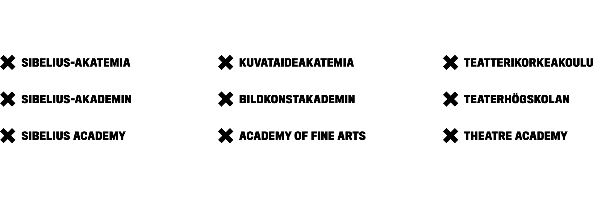
Minimum sizes of the logotypes
The minimum width of the Uniarts Helsinki logotypes is 15 mm.
The minimum width of the academies’ logotypes is 30 mm.
The minimum width of the “X Academy” signature (when separated from an academy logo) is 20 mm.
Emblem colours
Colours are an essential part of Uniarts Helsinki’s and the academies’ visual identity.
The following alternatives are available:
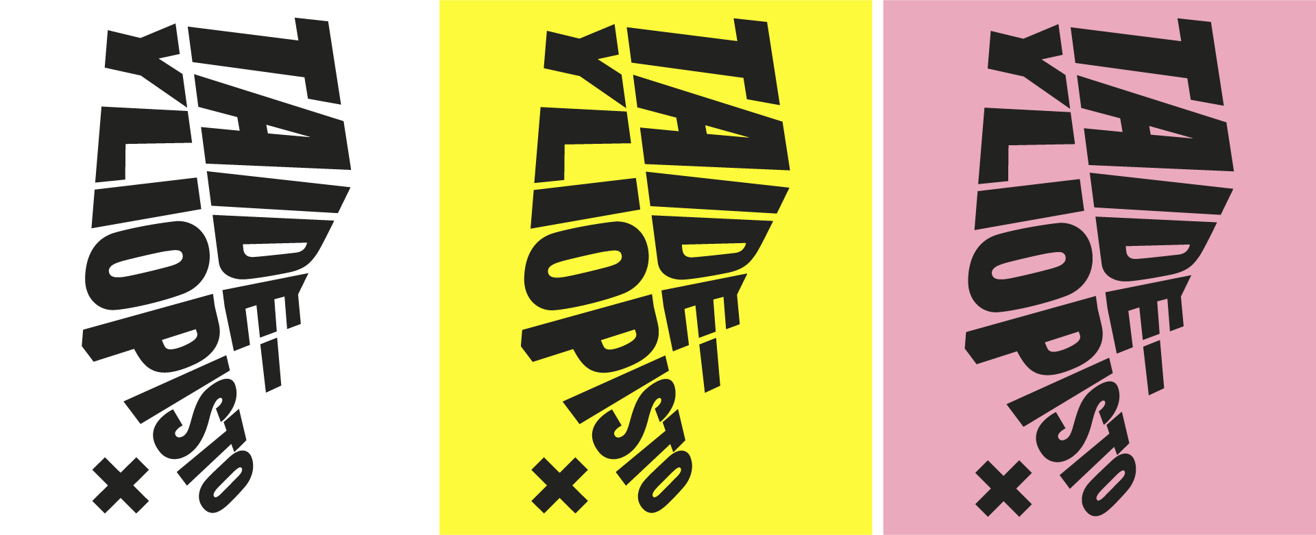
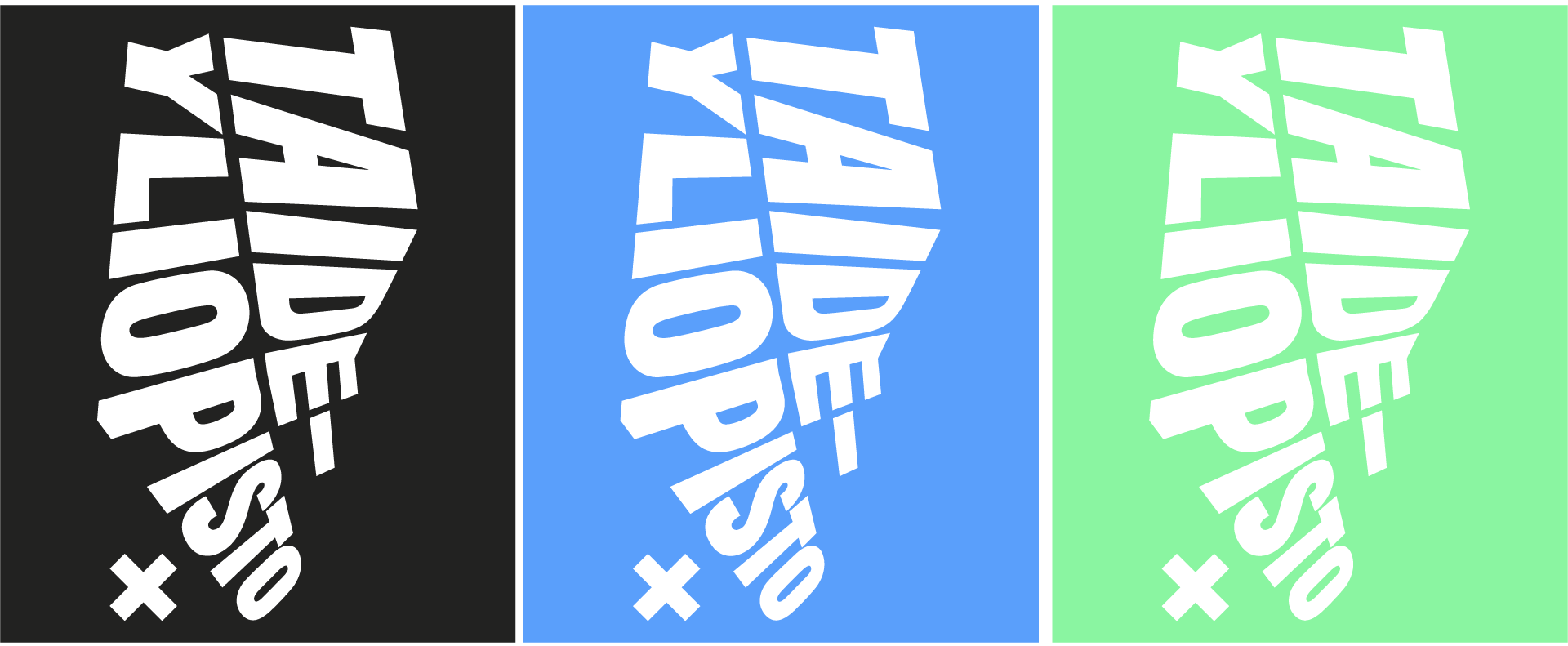
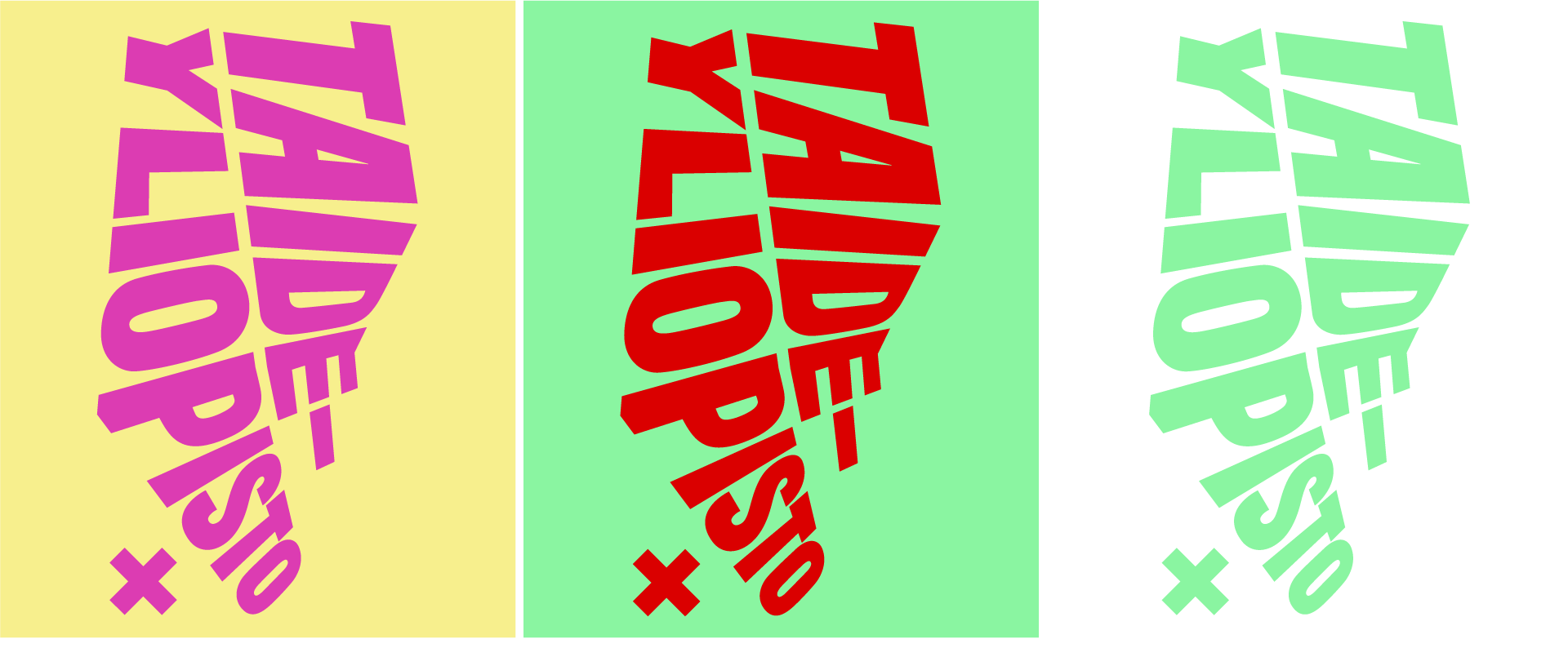
The logo can also be used coloured on white.
Visual image colours
Uniarts Helsinki’s visual identity is colourful. All colours, not only those that are pre-defined, can be used. No specific colours are designated for any academy.
For print publications, a set of CMYK, RGB, and Pantone effect colours are available.
Print colours
Depending on the method, print publications use either CMYK or Pantone colours. The CMYK four-colour model is used for print publications. The CMYK model consists of four basic colours: cyan (= C), magenta (= M), yellow (=Y), and black (=K). The CMYK model works by partially or entirely masking colours on a lighter, usually white, background.
In the Pantone system, each colour is mixed separately before printing.
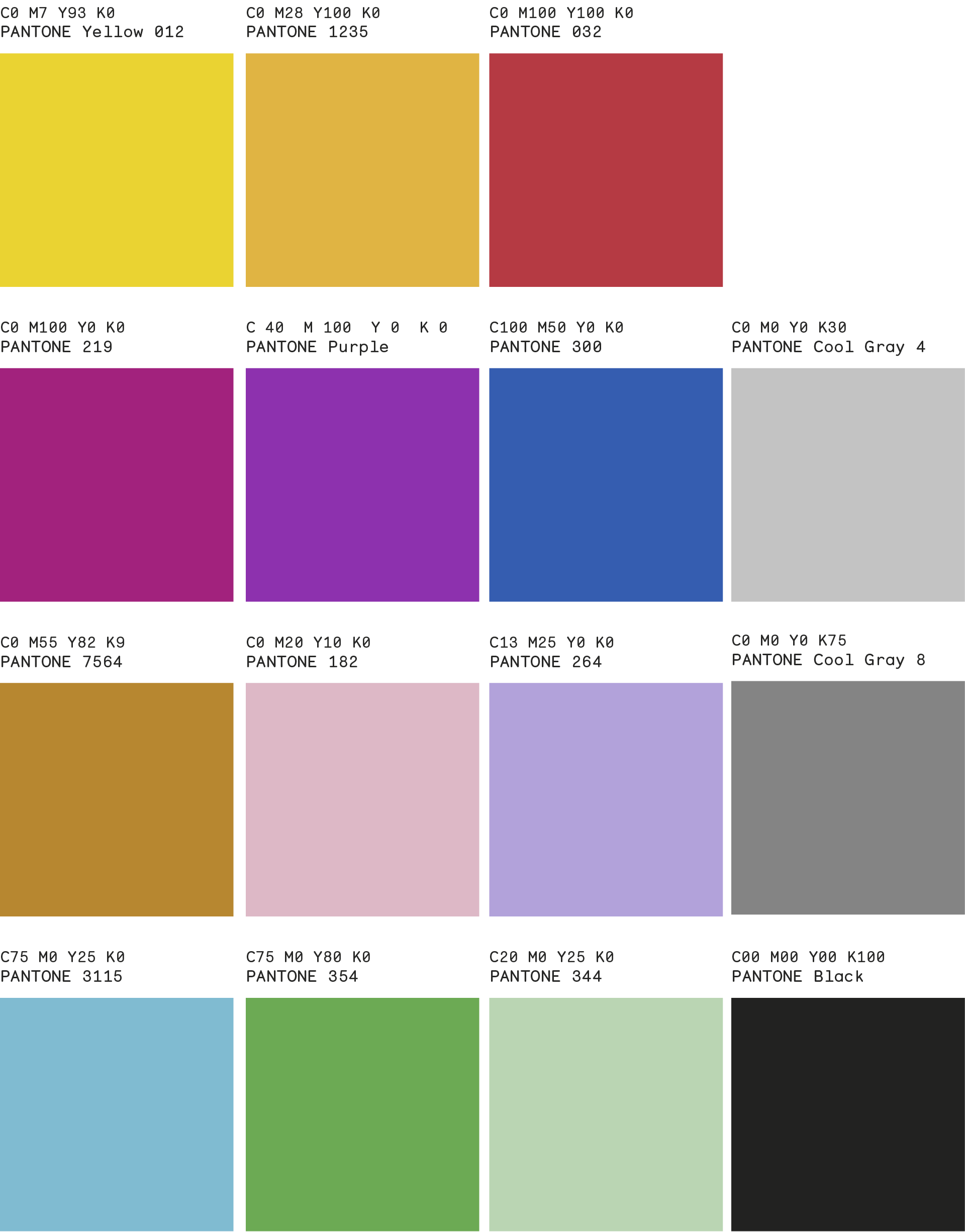
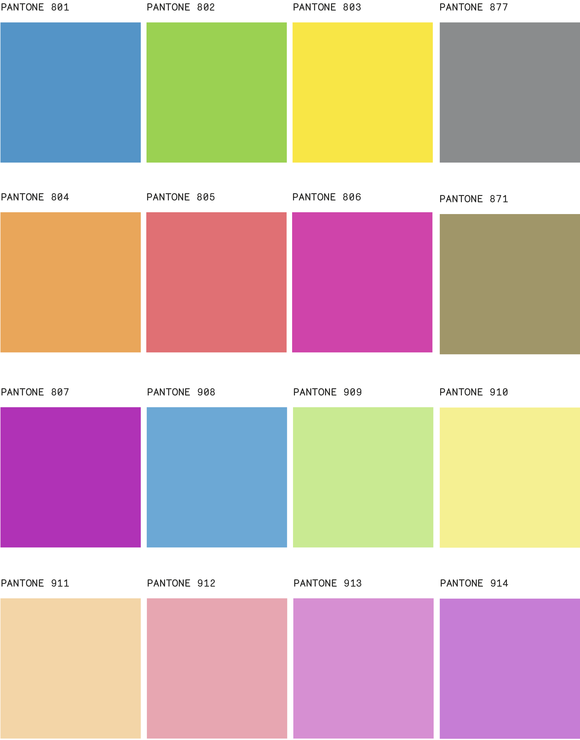
Intense colours
Intense Pantone colours can also be used for print publications. Note that the colours you see on the screen will not look the same when printed.
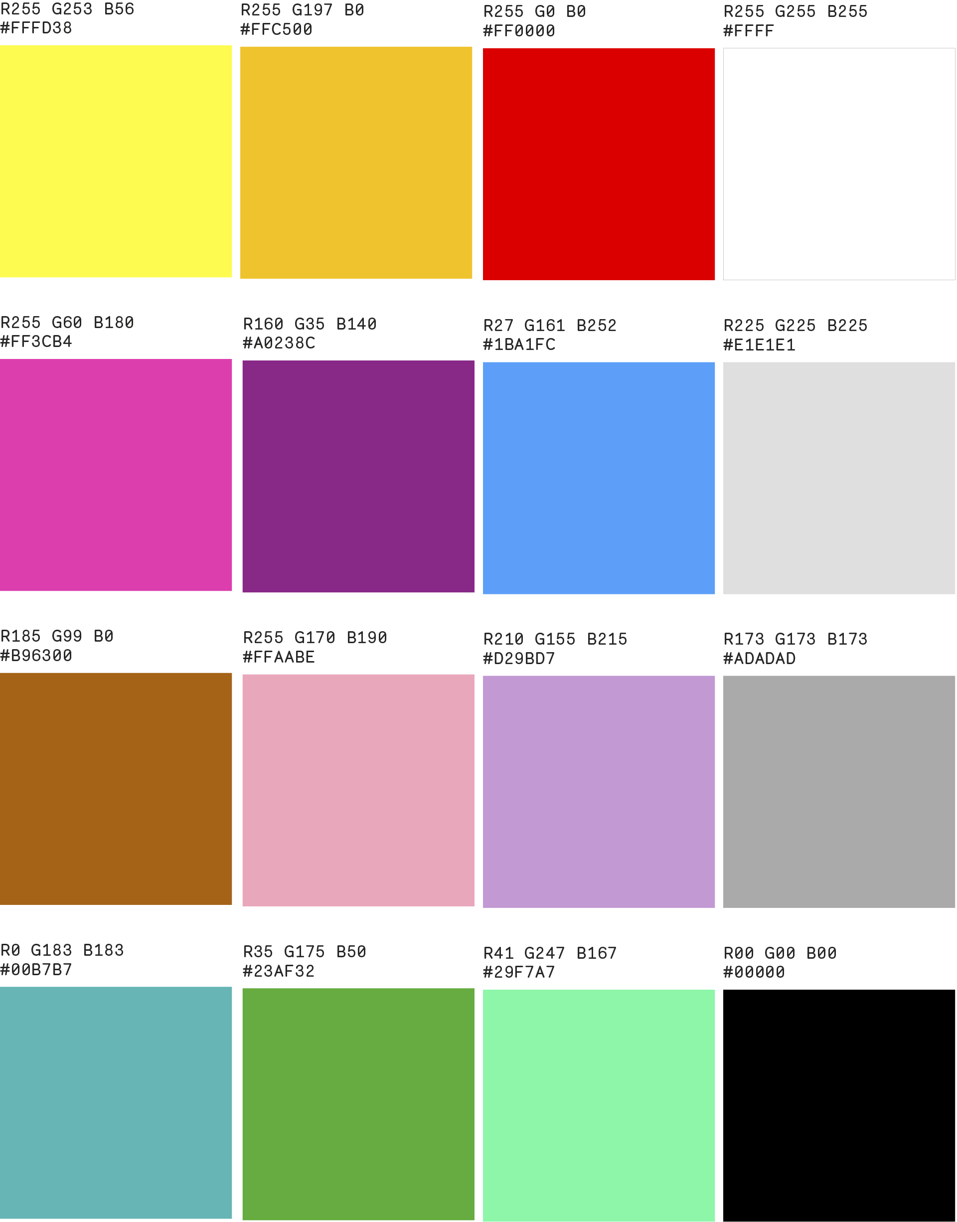
Colours for digital use
Digital applications (the Web or MS Office software) use RGB colours.
RGB is a system for screens and the internet. In RGB, red, green, and blue are added together in various ways to reproduce a broad array of colours.
Typography
Three font families are used in Uniarts Helsinki’s visual identity; Titling Gothic, Benton Modern and Monosten. Subcontractors can purchase necessary licenses from the internet. Link to font distributors’ website: MyFonts.
Arial Black and Times New Roman fonts are used in office applications such as Powerpoint and Word.
