Brand architecture
How the brand architecture of Uniarts Helsinki is structured and how the sub-brands of the academies relate to it.
Principles
Uniarts Helsinki and its three academies have a common visual identity that allows us to independently use the Uniarts Helsinki umbrella brand and the three academy sub-brands and names. The identity is characterised by individually designed logotypes/wordmarks. The common denominator for the visual identity is the X sign.
NB. For practical reasons most of the images show the Finnish language versions of the logotypes and wordmarks. They are also available in English and Swedish.
Uniarts Helsinki umbrella brand
The X sign and the common visual identity.
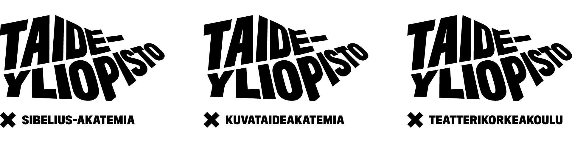
The Academy sub-brands
The three academies share a visual image within which they are distinguished from one another through artistic content.
Logotypes and the X sign
Uniarts Helsinki’s and the academies’ logos consist of a logotype and the X sign.
Below you’ll find guidance on using our logos. If you need to download them, you can get the logo files from the basic graphic elements page.
Logotypes
The university and the three academies all have separate logotypes/wordmarks that highlight each brand name. The common denominator for the logotypes is their shape. The “X Academy” signature is always a part of the academies’ logotypes.

X sign
The X sign is the common sign for Uniarts Helsinki and the three academies. Use only the original logo files which you can get from the intranet or the communications team at Uniarts Helsinki.

Brand architecture for Uniarts Helsinki’s visual identity
For Uniarts Helsinki’s visual image, the university logotype and the X sign can be used flexibly.
Some examples:


Both the logotype and the X sign must always be visible on the main surface of the application.
Brand architecture for the academies’ visual images
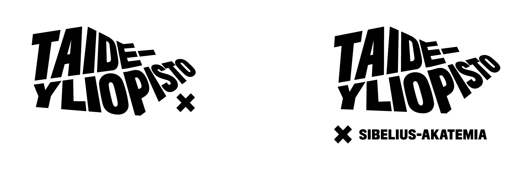
In the academies’ visual images, the academy emblems are always used in their basic form. The academy logotype and the “X Academy” signature can be separated to highlight the university, if the application surface allows.


The academy logotype and the “X Academy” signature must always be present in the application’s main surface.
Sub-organisations, concepts and the brand architecture
Under the “Uniarts Helsinki” umbrella brand and the academy brands, it is possible to highlight certain sub-organisations and marketing concepts.
The sub-organisations and concepts form the following three groups
Designated sub-organisations.
Marketing concepts, which can, in special cases, be given an individual visual image.
Existing concepts (created before the “Uniarts Helsinki” brand).

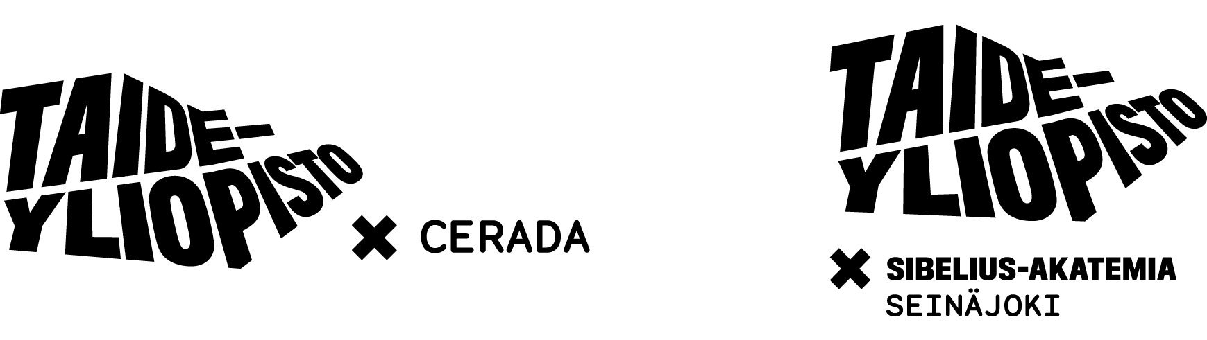
Sub-organisation logo lockups
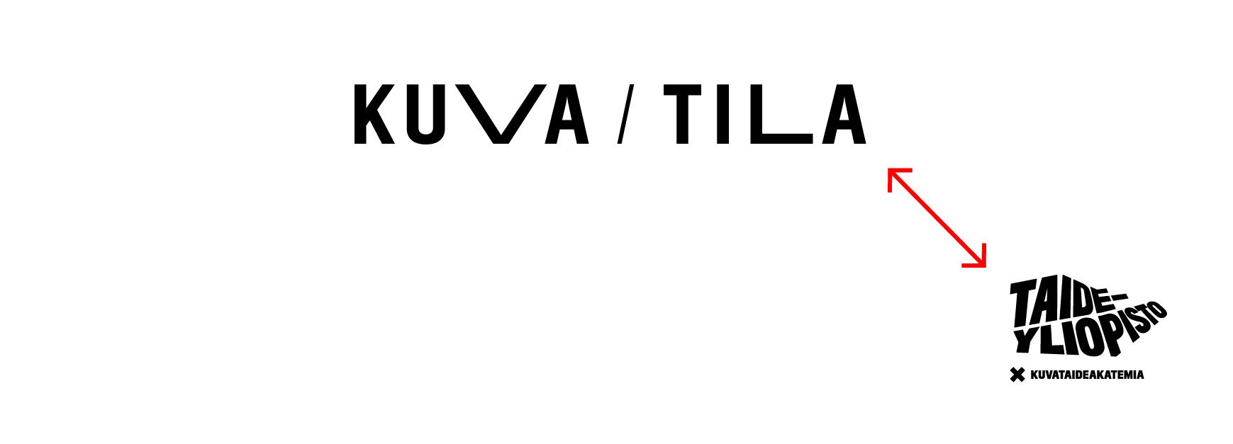
Sub-organisations consist of, for example, units, centres, research projects and services.
Uniarts Helsinki’s sub-organisations
The names of Uniarts Helsinki’s sub-organisations: the X sign is placed between the name of the organisation and the logotype.

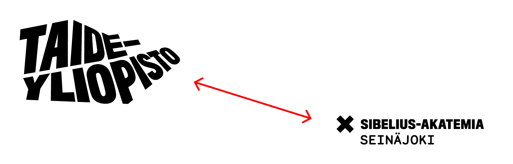
The academies’ sub-organisations
The name of the sub-organisation is placed next to the academy logotype under the “X Academy” signature. For the sub-organisation names, always use the Monosten C font.

A sub-organisation is not entitled to an individual visual identity.
Flexible use of the sub-organisation logo lockups
The sub-organisation names can be separated from the logotypes, if necessary.
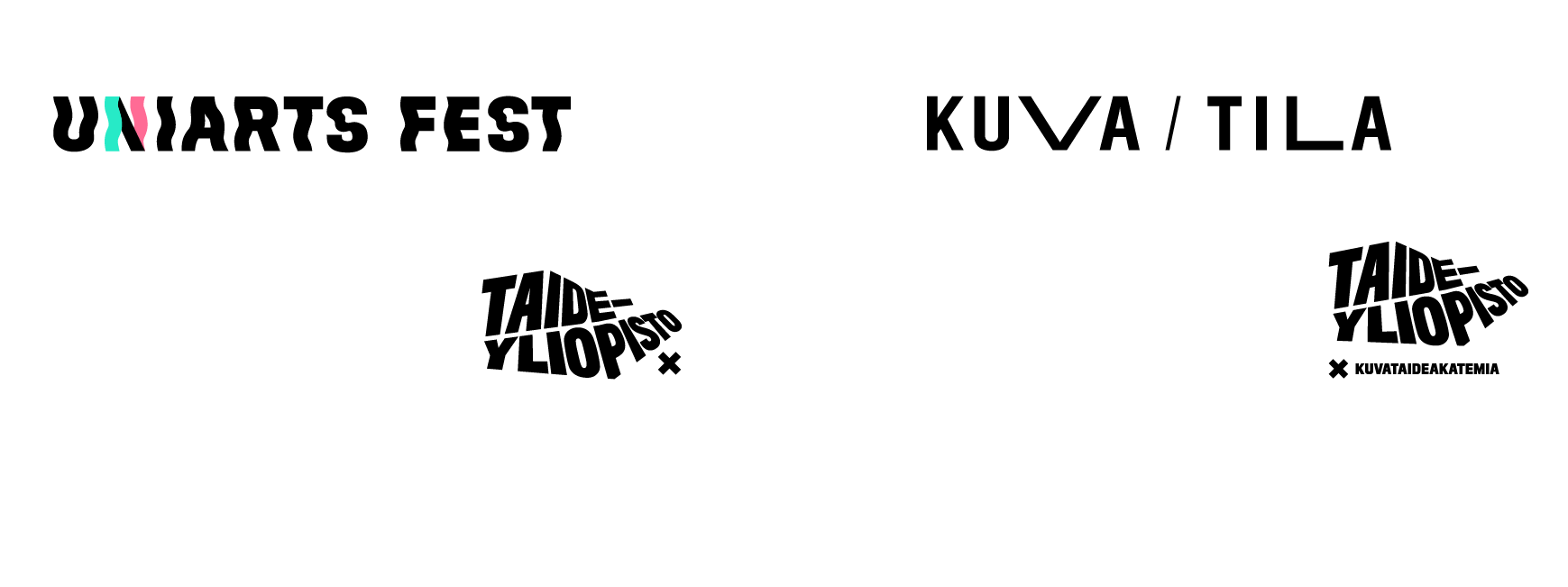
Logotypes and visual identities for marketing concepts
Uniarts Helsinki’s marketing campaigns and service or content concepts, events, festivals, and competitions can, on special terms, be highlighted with an individual name and visual identity.
The individual names and visual identity must be in line with Uniarts Helsinki’s brand and visual identity.
All concepts must include the Uniarts Helsinki logotype or an academy logotype as a signature.
Some tips for designing individual visual identities:

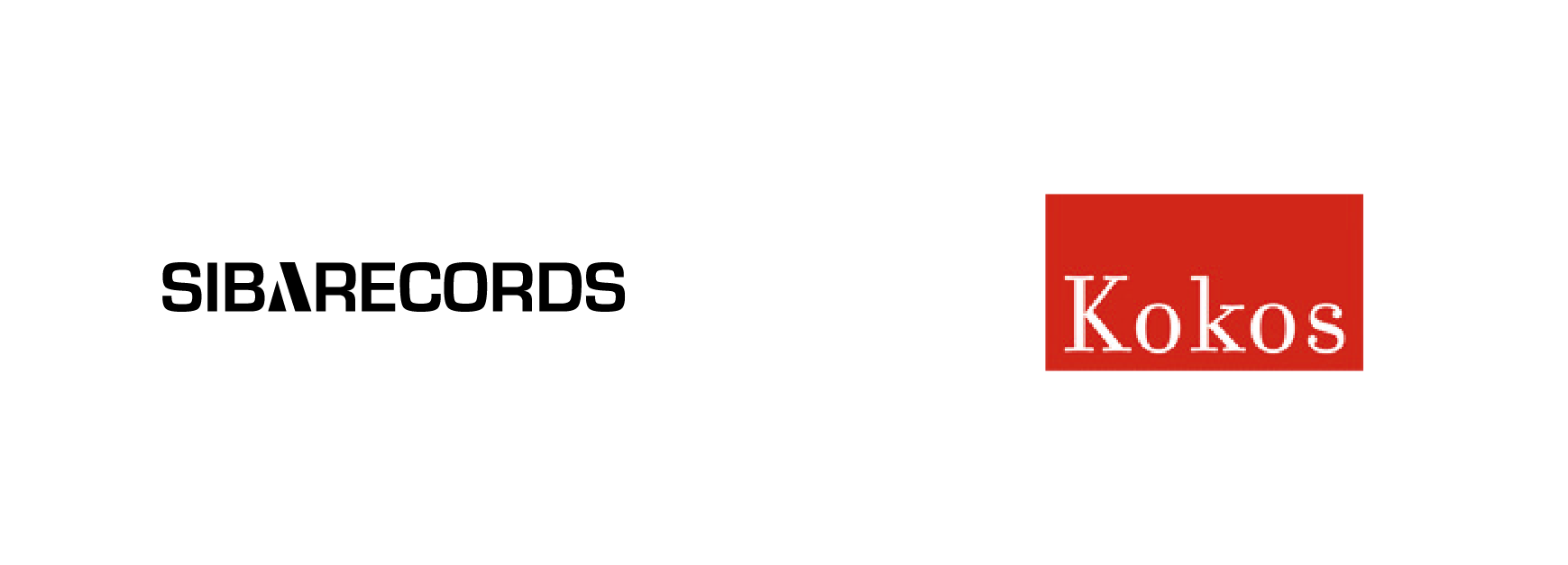
Existing concepts and visual identities
The existing visual identities for service and content concepts can be kept for reasons of recognition and cost effectiveness. The concepts must, however, be signed with a Uniarts Helsinki logo or an academy logo lockup (logotype + the X sign). In the long run, the university aims to update the existing concepts to follow Uniarts Helsinki’s visual branding.
Criteria for the different brand architecture levels
1. Uniarts Helsinki and the academies
No other units can be added to this level. Uniarts Helsinki and the academies are the only units with a right to use individually designed logotypes.
2. The sub-organisations
This level includes all Uniarts Helsinki’s internal services, regional units and research projects of a permanent nature.
3. Marketing and content concepts
This level includes marketing and content concepts with an urgent need for a distinguishing and communicable identity of their own. All concepts at this level must have explicit commercial, marketing or communicative objectives. At this level, the concepts are often campaigns of a limited duration. The sub-organisations do not belong in level three.

Existing concepts
Existing concepts can be kept on the following grounds:
- No funds for an update of the visual identity are available.
- The concept is widely recognised, and there is no need to change its visual identity for the present.