Event marketing
On this page, you can read about Uniarts Helsinki’s visual identity when promoting artistic and research-related events. The page presents the most common applications.
Visual look and feel of event marketing
Uniarts Helsinki’s visual identity guidelines serve as the backbone for designing the visual look of a specific event. The aim is to maintain visual consistency when designing the overall looks of all events. Some events may differ slightly from the visual identity under certain conditions.
The principles of layout, positioning, image and colour usage, brand visibility and typography are common for all applications. The templates include a colour palette and pre-determined typography settings.
You can ask for the templates and guidance on how to use them from Uniarts Helsinki’s graphic designer.
Colours and typography
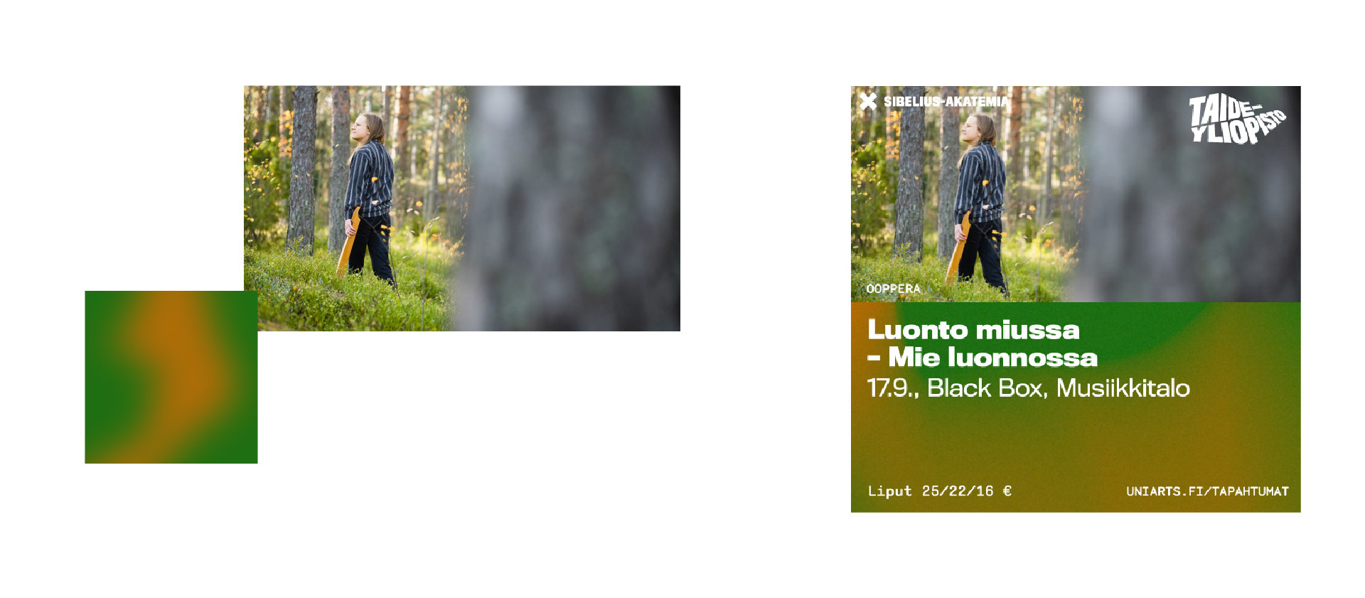
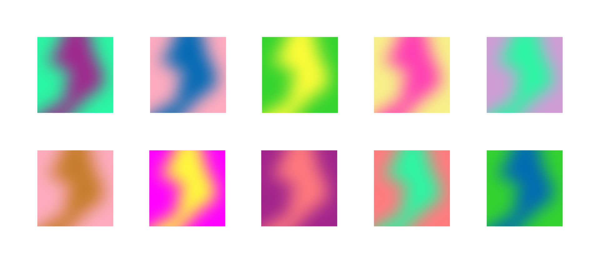
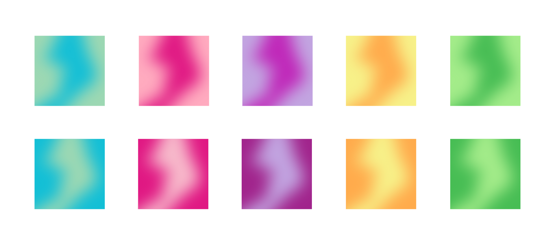
Uniarts Helsinki’s brand is vibrant and multi-coloured. That is why it is important to try to use a lot of colours and to keep switching colour schemes. Uniarts Helsinki’s brand identity allows the user to choose exactly the colours and colour combinations that they want. Nevertheless, the choice should follow the principles presented here. The most important rule is to make the text and logo stand out enough.
Colours in applications with images
Colours in applications with no images
Typography
In event marketing, the fonts specified in Uniarts Helsinki’s visual identity guidelines are used more restrictively. For headings, Bold and Regular weights of the Titling Gothic FB Normal font are used. A and C weights of the Monosten font are also used. In longer texts, the Benton Modern Two font family is used in its entirety.

Digital applications
Social media
An animated or a static marketing image can be designed for social media platforms.
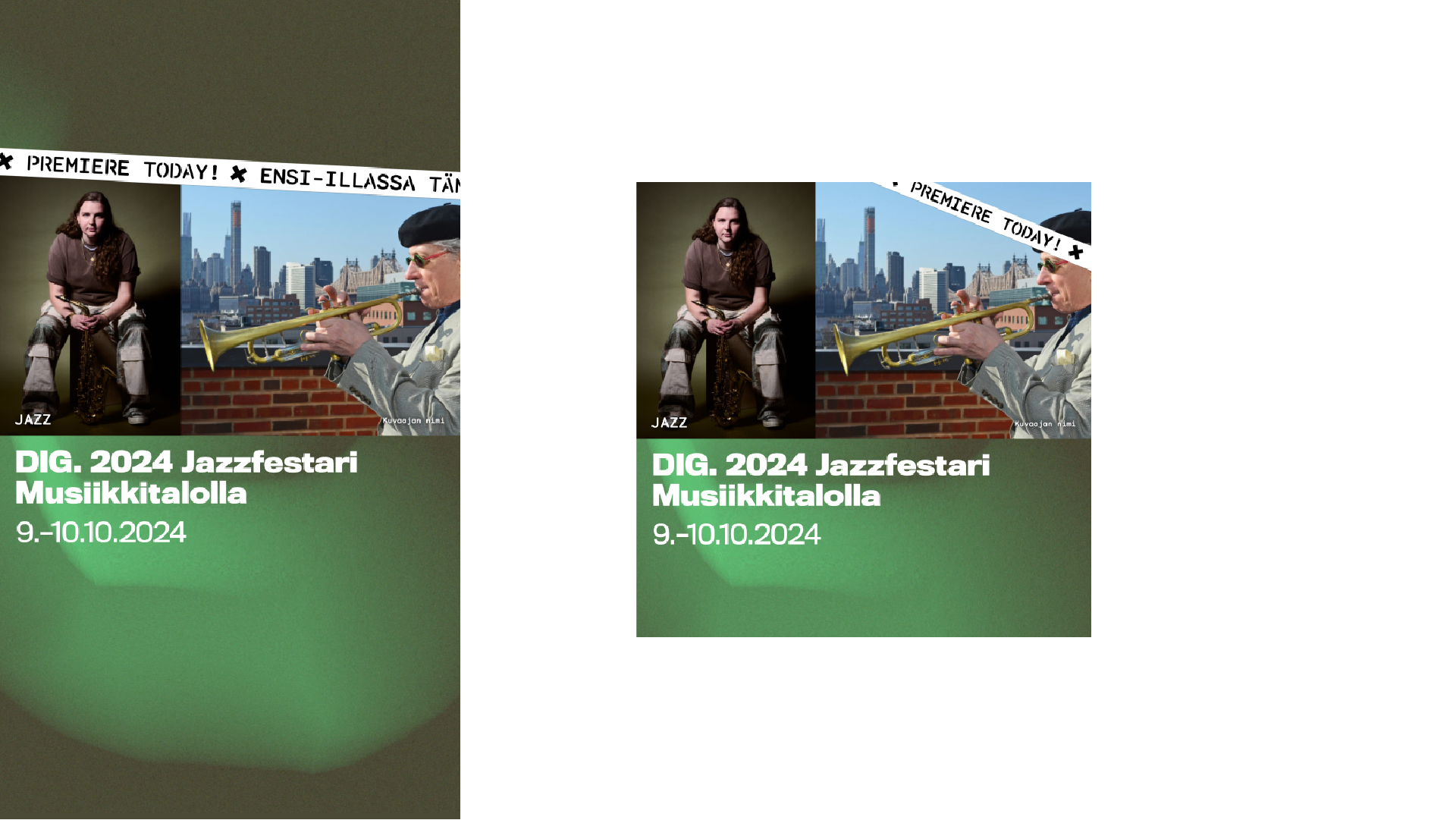
Musiikkitalo media wall

Banner adverts

An image for Uniarts Helsinki’s event calendar

Print applications
Poster
The dimensions of a poster are in a 9:16 ratio (236x420mm). In addition, sizes A3 and 500x700mm (A-board) can be used.
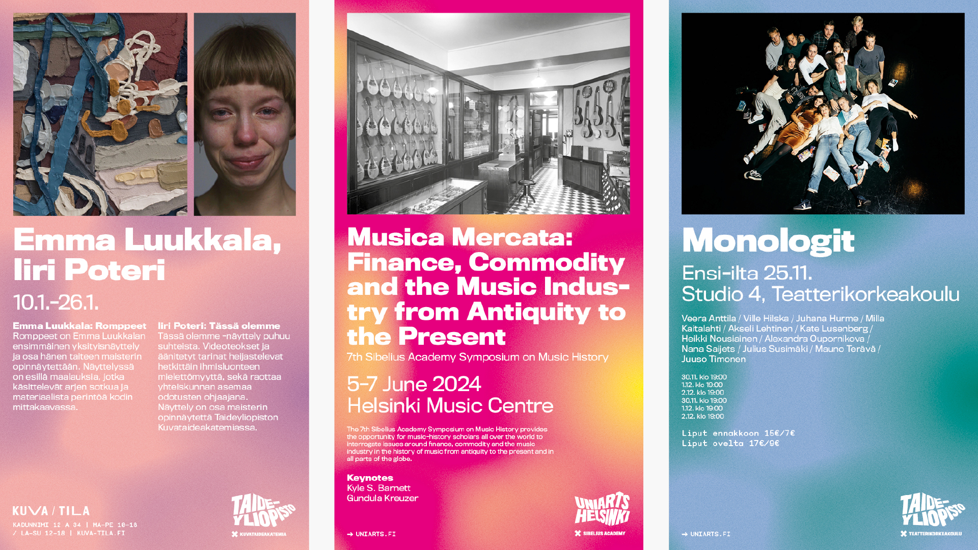
Forcing images of artworks into a specific format is not necessary. The images do need to be aligned with the top and side margins, however. Including an image is voluntary. It is better to have a poster with just text than use a bad-quality image.
The basic design principle is that the main heading should be as large as possible considering the space, all the while taking into account the margins and paragraph spacing.
The templates come with pre-defined text styles.
Preferably, the logos of partners or sponsors should be made to match the poster’s colour or otherwise be presented in monochrome.
Each academy has their own template in three language versions. The Theatre Academy also has a poster template in landscape orientation.
Other applications
The visual identity principles for marketing presented on this page also apply to the following:
- Live streams and video recordings
- Images on campus info screens
- Opening images for performances
- Programme schedules
- Programme booklets and programme schedules
- Books of abstracts
- Signage
- Rollup banners and other promotion
